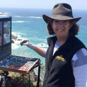
Authors Posts by Irene Ruddock

Irene Ruddock

36 POSTS 0 COMMENTS

One of Rick Mundy’s Adirondack paintings, ‘These Mountains 1'

By Irene Ruddock 

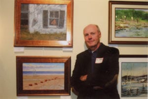
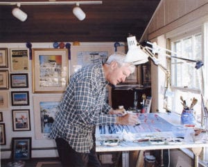
Rick Mundy is an award-winning watercolor artist who specializes in realistic paintings of Long Island, the Adirondacks, the Caribbean Islands, New York City, Africa and Alaska. He is noted as being one of the top art businesses on Long Island and has been published in Art Business News, The New York Times, Boater’s Digest and the Encyclopedia of Living Artists.

I recently visited Mundy’s Setauket studio to get a sneak peak of the artist’s upcoming exhibit featuring 60 watercolor paintings at the Bayard Cutting Arboretum in Great River. An artist reception is scheduled for Sept. 2 and again on Sept. 23 from 1:30 to 3:30 p.m. 

I am amazed by the vast variety and creativity of your portfolio. How do you think of all these ideas? 

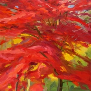
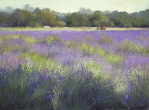
Painting is a celebration of the creative spirit and all that is beautiful in nature. As a teacher of biology, I learned more about nature, which is a recurring theme in my paintings. It is fun and exciting and I can’t stop myself once I get an idea! I like to paint in themes and in a series, and I most often do a diptych or a triptych. 

When did you first decide to become an artist and was there an artist who encouraged you? 

I enjoyed art since I was a child being inspired by John Nagy and winning a few contests, but later I apprenticed with the watercolorist Andrew Stasky who encouraged me to paint in transparent watercolor — where the light travels through many layers of paint to the viewer creating a fresh, clean painting.

‘These Mountains 111’ by Rick Mundy

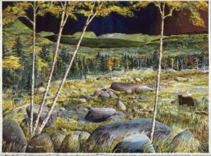
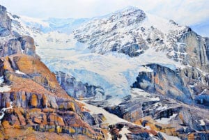
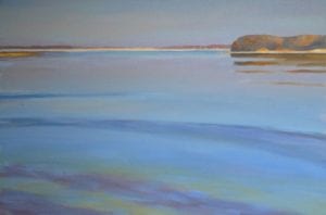
Your new exhibit sounds stunning with a 360º view of the Adirondacks that includes a series of eight paintings. What is it about the mountains that attracts you so?

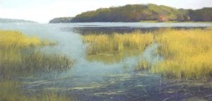
 I was an outdoor guide licensed by the NYS Department of Environmental Conservation for decades. The Adirondacks possess the calm of a woodland pond, the roar of a gorge in the spring and have ever-changing personalities from season to season. I know practically every trail in the mountains — its waterfalls, rocks and special ledges to stop for lunch! I enjoy going higher and deeper into the mountain where, in my mind, I compose the essence of the scene I want to paint — moving water, rocks, wildlife. I don’t photograph or sketch much; instead I develop the ideas in my mind so that these paintings are not actual places —they are created in my painting.

How has your extensive mountain climbing influenced your philosophy of life in other ways? 

I feel that nature feeds the soul. Being at one with nature, not fearful, but calm with the knowledge of the beauty that nature can deliver. Knowing Mother Nature is in charge and respecting her vastness. She will show you great things, but she is in charge. 

‘Royal Adornments’ by Rick Mundy

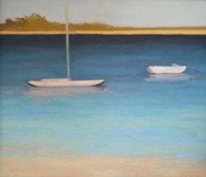
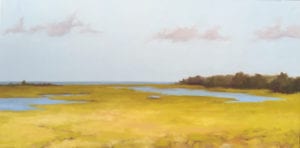
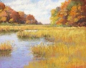
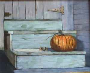
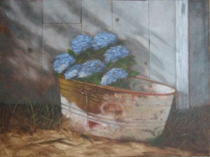
You are showing three rooms of paintings — Long Island, Adirondacks and the third titled ‘Well, … certainly different.’ Can you give us a hint about that? 

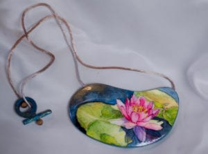
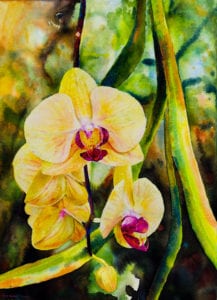
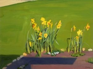
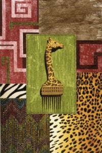
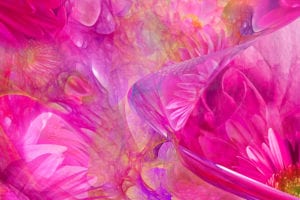
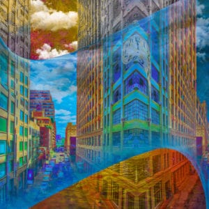
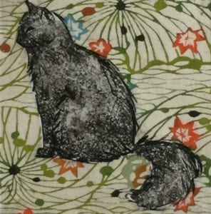
The Long Island paintings are all about the special beauty of the island’s beaches, boatyards, barrier islands, etc. In the last room, I exhibit my African collection including royal hair combs, animal skins and beading; my tropical mosaics, which look like Tiffany glass; my floral Gingko paintings; and some cityscapes.

What kind of presentation are you planning at your art receptions?

I am going to show examples of sketches and notes that I worked from, even the ones that didn’t deliver the look I wanted. It will show how the Adirondack paintings, which took two and a half years to complete, finally evolved.

What would you like the viewer to take away from this exhibit? 

I would like people to see in my paintings something in nature that they may have missed or wish to experience. I especially want to share with the viewers all the beauty I have witnessed. 

View Rick Mundy’s exhibit at the Bayard Cutting Arboretum, 440 Montauk Highway, Great River from Aug. 30 to Sept. 30. The arboretum is open Thursday to Sunday from 11 a.m. to 4 p.m. For parking fees and restaurant information visit www.BayardCuttingArboretum.com. Visit Rick Mundy’s website at www.rickmundywatercolors.com.

All images courtesy of Rick Mundy

‘Dutch Plate and Tulips,' watercolor

Artist Statement:

’ My goal is to design a watercolor that is an exciting, moving feast that celebrates my heritage. I paint objects that have deep personal meaning, attempting to push the medium by layering colors so the painting is saturated with richness, depth and clarity.’   Eleanor Meier

By Irene Ruddock

Eleanor Meier

Setauket artist Eleanor Tyndall Meier is a contemporary realist still life painter. A former art educator, her work has been published in the New York Times, New Art International and Splash: Watercolor Discoveries. Meier has received many awards in juried exhibitions, both nationally and internationally, and she is a signature member of the Baltimore Watercolor Society as well as exhibiting with the Rhode Island, Houston and Adirondack Watercolor Societies.

A former president of the Catherine Lorillard Art Club, Meier is currently on the advisory council at Gallery North and the steering committee of The Long Island Museum’s LIMarts, where she was chosen to be August’s 2018 Artist of the Month at the museum’s Visitors Center.

I recently had the opportunity to interview Meier as she prepares to move her art studio to Centerport.

You have a breathtaking array of awards and accomplishments. What do you consider your most meaningful? 

After retiring from a career of teaching art to high school students, many of whom are dear friends today, I had the opportunity to paint and make art a daily activity, to exhibit and to develop friendships with other committed artists. Using skills developed as a teacher I now find a special fulfillment in planning research trips to galleries, colleges, museums and other art centers.

How do you design your compositions? 

‘Kimono and Apples,’ watercolor

I paint large still life tableaux that are filled with treasured objects arranged on patterned and textured fabrics. The images consist of solid forms that reflect shifting nuances with webs of shadow. Using themes such as kimonos, Delft china, silver Revere bowls, cups and saucers, colored glass, white objects — whatever deeply moves me and excites the mind’s eye. I try to design the arrangements so that the painting will be infused with a sense of myth, mystery and magic. 

How do you choose the objects for your paintings? 

I use objects that have been passed from generation to generation, objects that have the potential for significance because of past association. They may be grand or humble, glistening or tarnished, but they must animate the surface, breathing energy and vigor into my compositions. 

Is there another art form that you enjoy? 

Since the human figure is one of the most enduring themes in the visual arts, I find that drawing from the live model inspires all my artistic endeavors. I find it is a needed exercise to sharpen the vision, improve eye-hand coordination and to energize the right side of the brain.

Are there artists from whom you draw your inspiration? 

I admire the works of Dine, Demuth, O’Keefe, Rothko, Beal and Freckleton. I have studied Dine’s work, noting that he selects an object that has meaning to him, uses it and transforms it into an exciting icon. I am drawn to the richness and luminous color in Rothko’s paintings, the use of the diagonal in the exciting compositions of Beal and Freckelton, the delicacy of a Demuth apple and the singular focus as found in an O’Keefe flower. I also attend galleries, studios and museums in New York City, Houston, Italy and Geneva — wherever in the world I travel.

Can you tell us about the Catherine Lorillard Art Club?

‘Cups and Plates,’ watercolor

The organization is a 130-year-old organization of women artists started by a bequest from Catherine Lorillard Wolfe, who was the only female on the board of founders of the Metropolitan Museum. The club exhibits yearly at the National Arts Club and the Salmagundi Club, attracting world class women artists. As an artist working alone, I find that being involved with this prestigious art organization has given me the opportunity to befriend many dedicated professionals and to share ideas which stimulate the creative process.

You are on the steering committee for LIMarts, an art group associated with The Long Island Museum. What can you tell us about that? 

Working with the innovative Neil Watson, executive director of the museum, has been fun. His interest in giving Long Island artists opportunities to exhibit their work has been exciting and inspiring. I am honored to have been chosen to be Artist of the Month and will be exhibiting at The Long Island Museum’s Visitor Center, 1200 Route 25A, Stony Brook through the month of August.

Soon you will be moving to Centerport. What will you miss most about this area?

I will always be involved in this area. The Three Villages and surrounding towns have become a vibrant area for art on Long Island. The many museums, galleries and artist studios have all raised the presence of art, making it an important center for art exhibits, art talks and art education. It is an exciting community in which to live and I am happy to have a small part in its new presence on the art map of Long Island. 

As a leader in the art world, what has art meant to you over the years? 

Art has always been my life and passion. I now have the time to paint every day, to exhibit, to work on various art-related committees, to plan art trips to the city and other venues. It makes life happy and fulfilling.

Turquoise vessel with coordinating wooden lid

Artist statement: ’ When I was a young man, I decided I would prefer to have some sort of pastoral life.  Working in my home pottery studio, “my island of calm, amidst the insanity of Long Island,” has afforded me some of the serenity I was seeking.’    Russell Pulick

By Irene Ruddock

Russell Pulick has been creating fine stoneware pottery for 45 years. He has been an instructor and studio manager at the Art League of Long Island for the past 18 years. Along with fellow potters, Russell recently celebrated the opening of a new clay studio and gallery in St. James called The Brick Clay Studio & Gallery where he is the studio manager and technical advisor. His beautiful pottery can now be found on four continents. 

How did you become interested in pottery?

 I took computer programming in college. I also took a pottery class and I was hooked! I wound up getting in trouble for arriving late to my programming classes and all covered in clay!  

 What are the properties of clay that you like?  

I love the plasticity of clay. It is this quality that can make it so much fun to work with. You can take clay anywhere, as long as you do it carefully. You are limited only by your imagination.

Starting from the initial idea, can you walk us through the process of creating a piece?  

The clay is first wedged (kneaded) to remove all air pockets. The next step, for a wheel “thrown” piece, is centering the clay. This is one of the most difficult and important steps. If the clay is not centered, a symmetrical vessel cannot be created. The clay is then shaped by hand, with the aid of a few specialty tools. Each piece needs additional work, such as trimming, adding handles or covers, or texturing. The pottery must then be completely dried, bisque fired, glazed and then glaze fired. I use brown, speckled stoneware clay and fire to 2232 degrees in an electric kiln. 

What is your method for glazing? 

Turquoise fluted tea pot

I make all the glazes myself, using recipes I have compiled by combining various minerals, chemicals and water. Different chemicals create specific colors and textures. Most pieces are dipped into a vat of glaze.

How do you decide on the design for each piece?

In general, I do not do surface decoration, so I try to make graceful, voluptuous shapes that are pleasing to the eye. Then I add a simple, beautiful glaze on the surface. This becomes my sole decoration on the piece.

What qualities make a great ceramic piece? 

For me, a graceful, elegant form makes a great piece.

What do you regard as more importantan esthetically pleasing piece or one that has practical function?

While all my pottery is functional, I still consider the aesthetic value to be most important, but of course form follows function. 

Is there a favorite type of piece that you like to design?   

Ceramic vessel with wood lid

I love making containers. I also love wood so it just seemed to make sense to incorporate the two. So for the last dozen years or so, I have been making wood covers for my clay vessels. 

What or who has influenced you in your artistry? 

I have been influenced by Chinese and Japanese pottery. I admired the work of Shoji Hamada, known as a national treasure in Japan. I also admired the English potter Bernard Leach. When I started to do pottery 45 years ago, there was no internet and the local libraries had only a few books. The books are where I learned about Hamada and Leach. I fell in love with their simple and elegant work.  

I see that you participate in many craft shows. What are some upcoming shows where one can purchase your work? 

I will be exhibiting at the Montauk Historical Society on July 15 and 16 and Aug. 12 and 13. On Sept. 2 and 3, I will be at the Montauk Lions Club and on Aug. 25 I will be at the Art and Craft Fair in Shelter Island. Lastly, on Sept. 24, my pottery will be shown at the West Islip Country Fair. A list of future shows are on my website, www.pulickpottery.com where pottery can be purchased directly.  

Where can someone take classes with you?

Cobalt Blue Jar with turned wood (Goncalo Alves) cover

I teach at the Art League of Long Island in Dix Hills. Classes are open to beginners as well as those more experienced with clay. We have a wonderful group of students and everyone has a great time as they learn how to make pottery. You may sign up for my classes at www.artleagueli.org.

Is there one piece of advice that you could give your students and others interested in pursuing pottery as an art form?  

I want them to know that anyone can learn pottery; it requires only patience and tenacity. I call it stick-to-ittiveness! 

What else would you like readers to know about you?  

Besides teaching, I also repair kilns and perform basic preventive maintenance for dozens of schools, universities and private clients. 

Tell us about your latest adventure. 

I am very excited to be a part of the new studio and gallery, The Brick Clay Studio & Gallery, 2 Flowerfield, Suites 57 and 60, St. James. It is a wonderful place for learning, creating and selling ceramics. Please check out our website at www.thebrickstudio.org. Setting up this new studio has been a wonderful adventure and all are welcome to stop by to see what we are all about! 

'Fulfillment'

Artist statement:  ‘My process melds classic photography with digital energy,                                               creating a medium I call interpretive photography’ — Mac Titmus

By Irene Ruddock

Mac Titmus

Mac Titmus is a photographer whose work melds classic photography with evolving digital art. He graduated from Adelphi University with a bachelor’s in English and a master’s in education/psychology. After a career in education, he retired to pursue his lifelong passion for photography. Titmus has won dozens of awards with his work appearing on magazine covers as well as being a distinguished judge. He is a leader in the art world and is currently vice-president of the North Shore Art Guild. He resides in Coram with his wife Mary, whom he calls his “best friend.”  

You describe your photography as ‘interpretative photography.’ Can you elaborate on that?  

“Interpretative photography” is a medium that pushes photography in an exciting new direction: one that defies rules and ignores the limitations of in-camera photography. It takes advantage of and explores the evolving techniques of the digital medium. The result is a fluid art form that merges proven old-school photography with the revolution of new-age photography.

What motivated you to begin to expand from the traditional view of photography to the more interpretive digital work?

When the desktop computer became available, I found I had a natural programing ability and quickly merged the two. Digital photography allows me to create what I once spent hours trying to produce in the darkroom. 

‘Think Pink’

What methods do you use?  

My methods are really the same as most two-dimensional artists, the only difference is substance. Digital art is created on transparent canvas layers on a computer rather than paper or canvas. The tools and the artistic instincts are the same: the use of pens, brushes, canvas, color, motion, balance and light. 

You have said that you combine motion and color with energy, which makes for an exciting experience for the viewer. Why is this combination important to your art? 

 I naturally see emotions as color and use it as a language expressing passion, fear, anger, joy or sadness. This reveals itself as shades from vibrant to subdued in my photographs. 

What is the single most important thing about your photography that makes it stand out among others?  

Without a doubt it would be my strong use of color to express emotion. I use colors as both harmony and conflict, hoping to bring out unaware emotions in people. 

‘On the Street’

You have so many incredible awards. Is there one that stands out as a favorite accomplishment?  

Every award is a wonderful validation, but without a doubt, my first-place award in the Wounded Warriors Benefit at Hutchins Gallery was a highlight. Not only was it an honor to be asked to participate, but it was also the first time my photography was recognized with a first-place award in the category of art, not photography.  

Who has been your strongest artistic influence?    

Having a literary background, I find my strongest influences are the images painted in imagination by the literary works of Emerson, Whitman, Thoreau, Cummings, Beckett and Bach. However, my primary visual art inspirations have always been the works of Jackson Pollock, Salvador Dali and Claude Monet.

Your art is now on scarves and articles of clothing.  How did that start?  

People have been telling me for years that my designs would make beautiful scarves, but the problem has been finding a manufacturer that would produce them for a reasonable price. I finally found a manufacturer that reproduces my work on material as I created it. Every scarf is a reflection of me and is unique for its design and vibrancy. In addition to scarves I’ve been experimenting with a line of kimono wraps and yoga leggings. All of my “Wearable ART” can be purchased through Sidewalk Alley Art in Mount Sinai. 

‘Shadow World’

How did you become director for Artists United in the Fight for Cancer?’

Breast cancer is very personal to those that have survived it or lost a friend or family member, as I have. My hope was that by bringing artists together we could be a force to make people more aware of the importance of early detection. We initiated a yearly event for Mather Hospital and the Village of Port Jefferson called Paint Port Pink. I also organized a benefit for the Fortunato Breast Health Center at Mather Hospital as well as an art benefit titled, Through the Eyes of a Child. This benefit raised $20,000 for the art therapy program at Stony Brook University.

Do you feel that photography doesn’t get the respect in the art world that it should? If so, do you know the reason why?  

Absolutely, especially digital photography because its legitimacy as a fine art is often questioned. Many galleries are still hesitant to include digital artists, although they admit its appeal and potential audience. They hesitate embracing it as they are uncertain they can adequately explain its process. The result leaves digital artists floundering for a position in the art community.

Do you have any exhibits coming up?  

Currently I have a solo show at the Clovis Point Winery in Jamesport through April 23 with an artist reception on Saturday, April 21 from 2 to 4 p.m. During the months of April, May and June I’m exhibiting several pieces in joint shows at The Alex Ferrone Gallery in Cutchogue, The Long Island Museum in Stony Brook (LIMarts) and at Expressions Gallery in the Stony Brook Holiday Inn Express. If you can’t attend those exhibits you may see my work online at www.karynmannixcontempary.com of East Hampton or through my website, www.augustusmac.com.

This article was updated on May 3.

'Chickens,' etching with Chine-collé
‘Bluejay,’ etching with Chine-collé

‘I draw inspiration from the familiar in nature. My etchings are a close inspection that reveal a whimsical character, and my landscapes portray scenes for which I feel a deep nostalgia.’

— Karen Kemp


Karen Kemp

By Irene Ruddock

A native of Long Island, artist Karen Kemp recently moved back from Boston, where she maintained a studio for 10 years. She studied at the Rhode Island School of Design and at the University of New Hampshire where she earned a degree in art history and has received numerous awards for her work in painting and etching. Her artwork is collected worldwide in private and corporate art collections. I recently had the opportunity to interview Kemp and welcome her back to the Island.

Why did you decide to move back to Long Island from city life in Boston?

There are many reasons for moving back, but one huge reason is that I wanted a home where I could have a larger studio space and a yard for gardening. And being closer to my parents was a big factor too!

What did you miss most about Long Island in the years that you were away?

I missed the open farmlands of the North Fork, the proximity of the shoreline and the marshy inlets of the Long Island. They inspire me to do more plein air painting.

‘Two Boats,’ oil on watercolor paper

I see that you were trained in Italy. What was that experience like?

It was a living fantasy! Shortly after graduating from college, I saved up enough money to live and study in Italy at a school for fresco painting, a process of painting on a freshly applied, damp surface with water-based pigments. I do few frescoes these days, but the process of layering and building up color all continue to inform my work today.

Did you study art conservation?

Yes, in Italy and also in New York City where I spent time apprenticing at a painting conservation studio from which I developed an appreciation for using archival materials.

Some have said that your landscapes in oil have a peaceful feeling to them. How would you describe them, and how are they different from other oil painters?

I try not to make an exact replication. I say that my paintings are representational, but not realistic. I attempt to evoke a calm mood, a setting or a sort of dreamscape. I am very sentimental about Long Island, and perhaps that comes out in the painting. My oil paintings are different from many painters because I paint on gessoed watercolor paper or matt board, which is easy to prepare and transport.

‘Mousewatch,’ etching with Chine-collé

You also are known for your etchings, which have been described as having a whimsical charm to them. Would you explain what etching is to people who may not be familiar with that art form?

Etching is one of the oldest methods of printmaking dating back to the 15th century. It is a technique involving a metal surface such as zinc or copper, and an acid-biting material that “eats” or “etches” into the surface creating a design or image. To print, ink is rubbed into the etched lines, and, with paper, it is run through a press. The image is then transferred to the paper, but in the reverse form. It is much more involved, but this is a simple version.

The background of your etchings often have what is called Chine-collé? Can you tell us about that technique?

Traditionally Chine-collé was used to create a tonal background for an etching using thin tissue or rice paper. The paper and the printing of the etching are run through the press together to create the finished image. Through experimenting, I have updated the technique using origami and patterned papers to achieve a colorful background for my subjects.

Your mother is the much-admired artist Flo Kemp. How has she influenced you growing up? 

My mom, master etcher that she is, taught me quite a bit about etching, and we still spend time in the studio together. I lived and breathed her work for so long, it naturally manifests itself in my work too. Mom has always encouraged and supported me along the way, providing me with etching advice and giving me business advice too.

What are your plans for the future?

I plan to develop my paintings and etchings even further. In responding to your questions, I’ve learned a few things about myself that I hadn’t stepped back to consider. I realize how much I enjoy processes and techniques, and how much they inform the style of my work. These will continue to influence the evolution and progression of my art.

What galleries represent your work?

Danette Koke Fine Art in NYC, who has carried my work for almost 20 years, Radius Gallery in Montana and Ogunquit Museum in Maine. I also show yearly at the Gallery North Outdoor Show and with the Setauket Artists. You may view my work and order etchings or landscapes at www.karenkemp.com.

'Long Winter Shadows'

By Irene Ruddock

Jane McGraw Teubner

Artist statement: ’Painting with pastels captures light in nature with a brilliance and mystery that takes me on a journey to the creative process!’

Jane McGraw Teubner is a Master Pastelist in the Pastel Society of America, as well as a Master Circle Recipient from the International Association of Pastel Societies. She is on the board of directors of the Catherine Lorillard Wolfe Art Club, which exhibits each year in the National Arts Club in Gramercy Park in New York City and is a Resident Artist of the famed Salmagundi Art Club, also located in the city. Recently her painting was on the cover of PleinAir Magazine, an international art journal devoted to outdoor painting. McGraw Teubner, who resides in East Northport with her husband Rich, recently answered some questions about her art.

Why are you drawn to pastels? 

I am drawn to pastels because of the immediacy, vibrancy and permanence of the colors. Originally, I worked in oils but I was working full time, with limited time to paint. The paint would dry out on my palette and I was lazy about cleaning my brushes. When I discovered pastels about 30 years ago, it was the perfect medium for a busy person. They are already dry, no mixing of colors, no chemicals, no brush cleaning! The effects you can achieve with pastels are not matched by any other medium.

Can you describe your process for painting a pastel?

‘Autumn Splendor’


It is an incremental approach. I start each painting with a small study of the composition. If that works, I go to the next step to create a value-based underpainting, usually with one or two colors to achieve the correct lights and darks. If I am pleased with that, I continue on to placing colors.

Where do you like to paint?

I love painting outdoors. I do a lot of studio work too, but that studio work is heavily influenced by working directly from nature. You cannot duplicate the colors of nature with a camera. The lights are usually too light and the darks too dark. My “go-to” place is Sunken Meadow State Park.

What is it about an ordinary scene that you can transform into an extraordinary painting? 

I try to put magic into my paintings. When someone looks at my work, I’d like them to say “How did she do that?” I like to take a scene and put something personal into it, my own vision and atmosphere. I use a limited color palette that helps enhance the serenity of my work.

I know that you teach pastel classes in your studio, as well as at the Teaching Studios of Art in Oyster Bay. What is the most important thing you can teach your students? 

I teach my students to not be afraid to fail, that you learn more from your mistakes than your successes.

Are there any secrets that you can share about your process?

‘Lavendar Field’

Yes, when I am working in front of an easel, I am living in the present, appreciating every moment, not wanting to be anywhere else. I consider that to be one of the secrets to a good painting or a good life — being mindful of what you are doing. I not only get a true sense of accomplishment for the finished product, but even more from the journey that took me there.

How can someone who is not able to come to a workshop with you learn about your process?

A few years ago I made a DVD with American Artist Magazine, which is available through www.northlightshop.com. It was filmed in Colorado and it’s about creating a painting outdoors.

One of your paintings landed on the Oct./Nov. cover of Plein Air Magazine along with an extensive article. What was that experience like?

It was very exciting to have been chosen to be interviewed for the magazine, but to get on the cover was a special gift I never imagined that would happen. It was a matter of being prepared for the opportunity and luck. Steven Doherty, the editor, chose one of my paintings from my website and submitted it to the publisher, along with three other artists’ work. That’s where the luck came in when Eric Rhoads picked mine.

After winning so many national and local awards, is there one award that you consider your most memorable?

‘Tidal Wash’

I received the Gold Medal of Honor for Pastels and Drawing from the Catherine Lorillard Wolfe Art Club a few years ago. It was a national juried show with artists participating from all over the country and it was my first national award. I have also received two awards from the Plein Air Easton competition. Just the process of getting accepted into the most well-respected plein air show in the country is an honor, with hundreds of people applying for just 50 spots, but to win an award is an outstanding accomplishment.

Where can we see your work?

People are welcome to see my newest work, upcoming exhibits and latest painting adventures by visiting my website, which is www.janemcgrawteubner.com. I am represented on Long Island at the William Ris Gallery East in Jamesport.

Are any of your hobbies related to painting? 

Running has been my main form of exercise for over 35 years. Learning to paint is like training for a marathon. Each single step is important. Running taught me to take baby steps and have patience with my painting. With much practice, you will get better.

'Back Porch Pumpkin' by Al Candia

By Irene Ruddock

Artist’s statement:  I hope that my paintings create a deeper sense of the relationship between ourselves and the splendid world in which we live, and are moving through too quickly. — Al Candia


Al Candia

Al Candia, a Stony Brook resident, has been interested in art since childhood. He began painting seriously while teaching English at Commack High School, continuing his studies of art at Stony Brook University. His workshops and private study included courses with many noted artists, including Joseph Reboli. Candia has become an award-winning artist exhibiting extensively in galleries all over Long Island. Chosen as Honored Artist by the Setauket Artists in 2015, Candia is October’s Artist of the Month at The Long Island Museum.

Can you elaborate on your artist’s statement?

I concentrate on the immediate world around me. I try to avoid “grand” subjects and tend to focus on the common, ordinary things that I find meaningful, but that we are sometimes too busy to notice: a farm fence in an open field, ancient beach chairs frozen in the snow, a jetty marching down into the ocean, flowers stuck in an old bucket, a small pumpkin on the steps.

How did you learn to paint?

The most important teacher is “the doing.” I can’t tell you how many acres of canvas I went through to arrive at a level where I began to consider myself as an artist.

It has been said that your paintings ‘touch the heart’ and are soulful. Why do you think that is?

Perhaps by going through life so fast, people might secretly yearn for a simpler way of life. They may enjoy slowing down a bit to “take a breath” and see the ordinary and realize it can be extraordinary.

You were an English teacher for 36 years before becoming a full-time artist. How did teaching influence your work?

For me, there is wonderful connection between fine art and literature. Writers and poets deal very much in the creation of images. An image can haunt us, fill us with joy. It is what makes a written work alive and vivid. It is what made me want to become a painter. I would see something — a broken seashell, a window in the late afternoon shadows — that would move me deeply and would be heavy with meaning. I very much wanted to celebrate that in a painting.

‘Back Porch Pumpkin’ by Al Candia

How do you find inspiration for a painting?

Robert Frost said that a poem begins with a lump in the throat. He was talking, of course, about being moved or shaken by something — an idea, an experience, an object — that needs to be expressed. That is true for me also. Recently, I came across a pumpkin on the worn steps of a back porch. I was so taken with this simple object that hardly anyone would see. I thought of the person who placed it there out of a some personal gesture. I thought it would make a touching painting that reveals some small aspect of our humanity.

What is your method?

I usually begin with a bunch of photos. I take these back to my studio and begin to work up a drawing idea for the painting. This is an important step where you design the composition, simplify, arrange the elements, and begin to think of color and light. From there, I proceed as many oil painters do by washing the canvas with a thin mixture of warm color diluted with mineral spirits. Next I begin to lay in the large shapes. Essentially I am carrying on a dialogue with the canvas, finding out what is working and what is not.

Why have you chosen oil painting over other mediums?

I think the medium choose me. It somehow fits my personality. Oil painting is slow moving and deliberate. It often will take a few days to allow the painting to dry before moving on to the next step. During these intervals the painting is percolating in my brain, trying to make the painting as good as it possibly can be. I compare it to a child with a wind up toy, winding that toy as tight as possible in order to release it to its maximum effect.

What is the biggest difficulty you encounter in the creation of a painting?

After working with a painting for a couple weeks, you can lose the sense of it, you lose perspective. You can begin to doubt yourself: did I make all the right decisions, is the color just right, did I overwork it, does it still capture what you set out to do? At this time, for me, it is important to have honest feedback from others. My wife is an important part in keeping me on track.

‘Hydrangeas in a Bucket’ by Al Candia

After all that work and effort, it must be difficult to let a painting go.

Not at all. I love the entire process of painting from the initial moment of finding a subject, to creating a design, through the struggle of execution. And hopefully someone will come along and appreciate the painting enough to buy it and hang it in their home. For me that completes the cycle, and the painting begins its life.

Beside the Visitor’s Center at The Long Island Museum in October, where can we see your work?

I will be exhibiting at the Setauket Neighborhood House in the 37th annual Setauket Artists exhibit from Oct. 22 to Nov. 20. People are always welcome to visit my studio by appointment. You can contact me by visiting my website at www.alcandia.com.

by -
0 107
'Johnston Canyon' by Ross Barbera

By Irene Ruddock

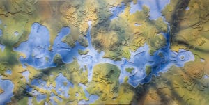
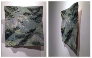
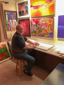
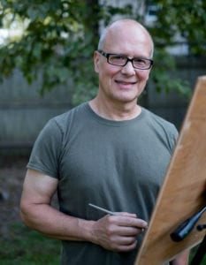
Ross Barbera, a graduate of Pratt Institute, is known for his representational acrylic paintings on canvas, watercolors on paper, original jewelry and digital and abstract art. Presently teaching at St. John’s University in the Art and Design Department in Queens where he was chairman for three years, Ross continues to win many juried awards and prestigious grants to pursue his prolific art career.

You were born and raised in Brooklyn, yet all of your paintings, and even much of your jewelry, are depictions of some aspect of the rural landscape. How did that come about?

I spent my summers at my family’s homes in Smithtown and Peakville, New York, and it was during these summers away from the city that I discovered the world of the natural landscape. They were welcome retreats from the city where everything was different: night times were cool, the air smelled clean. I was surrounded by deep forests, ponds and running streams. I was particularly attracted to the interplay of sunlight on flowing water. Nature became the primary inspiration for my paintings ever since then.

Much of your work is representational, yet you also paint in the abstract. What is your inspiration for your abstract work?

Although representational landscape painting has dominated my artistic direction, I discovered abstract, luminous worlds by observing pond surfaces and ice formations “close-up.” For me, this was the hidden world beyond the visible world that has provided the inspiration for my abstract paintings.

Water Lily Watercolor Pendant by Ross Barbera

You have an interesting process in watercolor painting that you teach in your classes and workshops. Can you tell us about this?

I have been experimenting with methods that enable me to retain the look of watercolor painting while achieving painted surfaces comparable in strength to acrylic on canvas; this eliminates the need to protect the painting by framing it behind glass. The first step in this process is to bind the watercolor paper to stretched canvas with a thick polymer gel medium. The finished watercolor painting is then protected with multiple layers of acrylic varnish, and for the top layer I apply a few coats of a removable UV protecting varnish.

Some of the background of your paintings have a stained glass effect — clean, clear, translucent and filled with saturated color. How do you achieve that?

I’ve always worked hard to give my paintings a quality of light, in the belief that good landscape painting needs to communicate a feeling of atmosphere; I never complete a painting until I feel it projects a strong quality of sunlight. Regarding my watercolor paintings, I believe the natural transparency of the watercolor medium contributes to a clean, translucent image. I do not apply watercolor paint with sable paint brushes. I predampen the color shape to be painted with a paint brush and clean water. Next, using needle dispenser bottles that have been filled with premixed watercolor to the consistency that I require for painting, I apply multiple colors into the predampened area, and I permit the colors to freely intermix and blend without working into them with a brush. This method of paint application results in clean, clear and beautifully translucent color shapes, and I believe the effect is further enhanced by the application of the final, protective layers of varnish.

‘Glacier’ by Ross Barbera

How does your digital work influence your art?

My wife Bonnie bought me my first tablet where I downloaded a drawing app. I was instantly addicted! I eventually downloaded a painting app and loved the convenience of digital plein air painting. Next, I began to export my digital paintings to my computer so I could continue to develop them in Photoshop. I restrict myself to basic brushes that come close to what I use in my acrylic on canvas paintings, and I do not use any effects or filters. I intend my digital paintings to be characterized by the same painterly quality that you would see in my paintings on canvas.

How did you become interested in creating jewelry? Can you describe how you incorporate your watercolors into your jewelry?

I started making jewelry when I was a graduate student at Pratt Institute. My early jewelry was created mostly in sterling, and I often incorporated enamels to add color. I am now using a wide range of different types of paper and wood and eventually discovered the limitless possibilities of building pendants, earrings, bracelets and hair pieces with layers of watercolor paper. I like building up layers on 140-pound Arches watercolor paper, and painting directly onto the surface with watercolor and acrylic paints. I coat the jewelry with multiple layers of acrylic varnish, and the final process involves heating the finished piece in an oven at 150°F, which hardens the varnish process.

What is the focus of your recent work?

I visited the Canadian Rockies with the intent of photographing the mountain glaciers and rivers for a new series of acrylic paintings that would be dedicated to the disappearing glaciers. I plan to continue in my effort to capture the diversity of the North American landscape in painting and will visit national parks throughout the United States and Canada for this purpose.

Where can we see your artwork?

I currently have an exhibit featuring my paintings and jewelry at the Comsewogue Public Library in Port Jefferson Station through the month of September. I also currently have a painting on exhibit in the juried show Colors of the Night at the Mills Pond House Gallery in St. James until Sept. 30. My paintings and jewelry can be viewed at any time by visiting www.rossbarbera.com, and my instructional videos can be found on my YouTube channel Realisticart. My jewelry can be purchased directly from my website, www.paperpendants.com.

by -
0 2185
'NSP Docks' by Christian White

By Irene Ruddock

If you only attend one gallery exhibit this summer, make it the stunning collection of new paintings by Christian White showing at The Atelier at Flowerfield in St. James this month. White is a multitalented artist creating works in stone, watercolor, graphite, gouache, trompe l’oeil, egg tempera and, of course, his ever popular luscious color-saturated oils paintings.

Your exhibit of new paintings has been described as ‘breathtaking.’ Do you have a favorite piece?

These paintings are an attempt to find something new in subjects that I have painted often over my career. I never really have a favorite piece, I am more interested in how the paintings look together, and I am very happy with how these look as a group.

You refer to yourself as a colorist. What is your secret to creating such pure, clean color that exudes light and atmosphere so well? How do you prepare for painting large pieces?

I believe that if one uses color, it should have a purpose, that is, a decorative, thematic and expressive function in the picture. I have no real secrets to my color ideas, except that I have studied the subject a great deal. I do have certain ways of preparing colors in advance when working on large pieces, which are partly influenced by certain modernist and abstract painters.

You have such a remarkable heritage with five generations of famous painters, architects, poets, sculptors, etc. Who do you admire and learn from most in your family line?

I learned a great deal from everyone in my family who I knew personally. It is hard to say which part of one’s education is most important; I believe everything one learns contributes to who you are. I admired my father, Robert White, a great deal and spent much of my youth learning from him by example. I also admired my maternal grandfather, Joep Nicolas, a lot. I studied with him briefly in Holland, as well as with my aunt, Sylvia Nicolas, and a Japanese sculptor named Shinkichi Tajiri. Joep had a facility and imagination that I never felt I would attain, so yes, I admired that very much, but all of them had important lessons to give.

Is there a present-day artist who you hold in esteem and would like to meet?

I think I would say the South African artist, William Kentridge. He has an originality which I find engrossing and magical, and although he uses some modern technology, most of his work is just charcoal on paper, I love that he creates such original work with such a simple medium.

‘Japanese Maple #2’ by Christian White

Which is your favorite art museum? Is there an art museum that you would like to visit but haven’t yet?

For most of my life I would have said: The Frick. But now I probably spend more of my time at MoMA. I would love to see the Prado some day.

Japanese Maple #2 appears to be a joyfully abstract painting that exudes the wonder and brilliance of autumn. Can you explain a bit about your abstract paintings vs. your more traditional approach?

That is one of several paintings where I have tried to bring exterior space and structure forward into the room, like a window moved forward perhaps. I do not exactly consider these paintings abstract, although I have borrowed some ideas from abstract painters, and I suppose there is a certain feeling akin to “action painting” in its execution.

‘Harbor, March’ by Christian White

The painting ‘Harbor, March’ created quite a stir. What do you think makes it so universally inviting?

That painting was based on a smaller study that I did on a very warm, still day in March last year. I was trying to describe the unusual color of the air that day. I am often trying to capture a familiar subject in a new light. I think the scale of this one gives it a more specific mood, perhaps.

It’s hard to surpass your superb draftsmanship. Would you consider an exhibit with just your graphite drawings? Do you draw with your brush while painting in oils?

I consider drawing to be the basic skill and language that artists use to communicate. In recent years I have become more interested in producing drawings as objects of art, so yes, someday I may have an exhibit of just drawings. Am I drawing with the brush when I paint? Absolutely.

‘A Clutch of Daffodils’ by Christian White

You are presently teaching at The Atelier. Can you tell us why you were drawn to teach and exhibit there?

I was intrigued by the idea of a school that would give students solid foundational skills, in an organized studio setting. I think an emphasis on teaching drawing skills (not just copying from two dimensions) is crucial, though difficult, toward making better artists.

You’ve said that you were influenced by the Southampton artist, Fairfield Porter, a friend of your father. What did you learn from him?

He was also very close to my mother (they were both art critics). Mostly I was influenced by his work, his ability to make realism look so much like modernism, his insistence on making every color a design decision and the way he simplified the subject, without making it any less immediate. Those were things I wanted to do as well.

The Atelier at Flowerfield, 2 Flowerfield, Suite 15, St. James will present the exhibition Christian White: Recent Works through Aug. 31. Gallery hours are Monday through Saturday from 10 a.m. to 5 p.m., closed Sundays. For more information, please call 631-250-9009 or visit www.atelierflowerfield.org.

Above, front and side view of ‘Topo Shift: MacIntyre Range, 2015.’ Its blue/white coloration is derived from winter hiking.

By Irene Ruddock

Winn Rea addresses environmental themes in her sculptures, installations, videos and works on paper. She has exhibited in galleries and museums, both nationally and internationally, being awarded many prestigious grants and awards. Presently, her work is being shown at the Heckscher Museum of Art in an exhibit aptly titled Earth Muse: Art and the Environment. I recently had the opportunity to speak with Rea about her latest venture.

Environmental Artist Winn Rea

The exhibit at the Heckscher describes its exhibit as ‘presenting the work of artists who view the earth as muse for contemplation of nature’s beauty and diversity.’ Can you tell us what works you are showing there?

At the Heckscher Museum you can see examples of my topographic relief paintings. They are based on my time in the Adirondack Mountains. I love going to the Adirondacks because I can unplug from the wired world and reconnect with nature.

How does your time in nature translate into your artwork?    

While hiking I “collect” shadows by photographing them. Back in the studio, I construct topographic reliefs based on U.S. Geological Survey maps of the area.  They are built out of 1/8-inch Russian birch plywood that I paint using colors and shadow patterns from the woods. People are fascinated because the reliefs are not solid, they are hollow like sea shells, and the shadow almost fools you into looking over your shoulder for the tree that cast it.

What other ways do you use art to express your interest in the environment?   

All of my works are a meditation on where I fit into the greater scheme of things on the planet. When I make videos, they are about the passage of time in the short term, like how the flow of water in a stream changes over the course of a day, or the long term — as in geologic time — which is explored in my works on paper that are made by evaporation.

In your works on paper, you say that you do not paint in the traditional sense, but tend to them as you would a garden. Can you explain what you mean by that?    

Well, it helps to know my process for the works on paper: first, I sculpt the paper, crinkling it into folds like mountain ranges. Then I flood the paper with pigment, which slowly evaporates leaving marks much like contour lines. So, in effect, instead of pushing pigments here or there with a brush, I work in synchrony with the natural process of evaporation. In gardening terms, I prepare the “soil” (sculpted paper), “water it” (pour pigments), and “harvest” the result — a three-dimensional painting on paper.

Above, ‘Topo-Shift- Upper Saranac Lake’

You are an associate professor of art at Long Island University C.W. Post. What do you wish to get across to your students about how art and the environment are related?

I want to give students confidence in their own creativity and help them cultivate their problem-solving skills through the design process. The reality is, their capacity to imagine and realize new, sustainable ways to thrive is the answer to our planet’s future.

In your world exhibitions, is there one country that you enjoyed the most?

I most enjoyed my travels to Korea especially to the tea farms in the mountains. Here the tea bushes are planted along contour lines that accentuate the form of the mountains. I felt most at home there.

Many artists are looking for longevity in their work, yet you describe much of your work as ‘temporal.’ Why?

I want people to enjoy my work and even collect it in order to have it in their lives, if it brings pleasure to them. But I am not interested in making a commodity.  I want my legacy to be longer lasting in terms of the way my work helps people to think about the world differently and to become more aware of the impact of their everyday choices on the planet.

Above, front and side view of ‘Topo Shift: Cliff Mountain, 2015.’

‘Falling Water’ appears to be one of your most influential and popular installation sculptures. What effect were you trying to achieve?   

In “Falling Water,” I made use of the sculptural and material qualities of our ubiquitous disposable water bottles. Cutting them on a curve releases the energy of a spiral. The clear plastic refracts the light, de-materializing the plastic. In a way, their beauty seduces us into ignoring their treachery — the needless use of petroleum products to package and transport a resource that we have as close as our tap.

What are you working on now?   

I am working on a series of small topographic reliefs that include bodies of water.  I am curious about bathometry (contours of the earth under water) and am exploring that margin between land and sea.

Do you have another exhibit coming up?  

Yes, I have works hanging at Gallery 46 in Lake Placid.  As part of the visual arts extension of the Lake Placid Center for the Arts, it is a great location for people to see my work in the context of the land that inspires it.

Can you tell us about your philosophy of life that influences your art?   

The philosophy behind my work can be traced back to time spent hiking with my dad as a young girl.  I loved the smell of the decaying leaves and movement of air amongst the trees. (I think of it now as the woods breathing.) My dad taught me to read the contours of the land while on the trail; back home he showed me where we had hiked on a 3-D topographic map. My dad also taught me about the natural cycle of things, of how the decay of one body feeds the life of another. This informs all my life’s work!

Winn Rea’s work is on exhibit at the Heckscher Museum of Art, 2 Prime Ave., Huntington through July 30. For more information, visit her website at www.winnrea.com.